Unit [VCL/FMX] RVItem / fmxRVItem;
type
TRVExtraItemProperty =
(rvepUnknown, rvepVShift, rvepVShiftAbs,
rvepImageWidth, rvepImageHeight,
rvepTransparent, rvepTransparentMode,
rvepTransparentColor, rvepMinHeightOnPage,
rvepSpacing, rvepResizable,
rvepDeleteProtect, rvepNoHTMLImageSize,
rvepAnimationInterval, rvepVisible,
rvepHidden, rvepShared,
rvepBorderWidth, rvepColor, rvepBorderColor,
rvepOuterHSpacing, rvepOuterVSpacing,
rvepVAlign);
Identifies an item property of integer type.
Positioning
Property |
Applicable To |
Default Value |
Meaning |
|---|---|---|---|
rvepVShift |
rect.items* |
0 |
Vertical offset, in % of item height (default), or in RVStyle.Units (see rvepVShiftAbs). Negative values move the item down, positive move it up (relative to the position specified in VAlign) |
rvepVShiftAbs |
rect.items* |
0 |
If non-zero, rvepVShift defines vertical offset in RVStyle.Units instead of %. |
rvepVAlign |
rect.items* |
ord(rvvaBaseline) |
Vertical alignment, TRVVAlign converted to integer. |
* "rect.items" include pictures, hot-pictures, controls, bullets, hotspots, labels, sequences, footnotes, endnotes, note references.
Borders and spacing
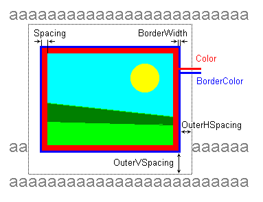
Scheme:
Property |
Applicable To |
Default Value |
Meaning |
|---|---|---|---|
rvepSpacing |
rect.items* |
1 |
Spacing around the item content, in RVStyle.Units. Must be a zero or a positive value. This is a padding, a spacing between the item content and the item border. This area may be colored with rvepColor. |
rvepColor |
rect.items* |
clNone |
Background color (TRVColor value). It is drawn below the image (and around the image, if rvepSpacing is positive). |
rvepBorderWidth |
rect.items* |
0 |
Border width, in RVStyle.Units. Must be a zero or a positive value. |
rvepBorderColor |
rect.items* |
clBlack |
Border color (TRVColor value). |
rvepOuterHSpacing rvepOuterVSpacing |
rect.items* |
0 |
Spacing around the border (horizontal and vertical), in RVStyle.Units. Must be a zero or a positive value. |
* "rect.items" include pictures, hot-pictures, controls, bullets, hotspots, labels, sequences, footnotes, endnotes, note references.
Pictures
Property |
Applicable To |
Default Value |
Meaning |
|---|---|---|---|
rvepImageWidth, rvepImageHeight |
0 |
If set to positive value, define size of the image in RVStyle.Units. The actual image is not modified, it is just drawn stretched. See also rvepAnimationInterval property below. |
|
[VCL and LCL] rvepTransparent, rvepTransparentMode, rvepTransparentColor |
(if they are TBitmap) |
|
Correspond to properties of TBitmap: Transparent, TransparentMode, TransparentColor. Limitations: ▪transparency is turned off in 256-color mode; ▪transparency is not supported when printing (although print preview shows transparent bitmaps) ▪TBitmap implementation of transparency is not ideal; sometimes it may cause weird colors for 256-color images (probably, it was fixed in last versions of Delphi) |
rvepMinHeightOnPage |
0 |
Affects printing, allows printing large pictures on several pages. Positive value defines minimal height of part of image allowed to be on page. For example: ▪1 – the image can be printed on two or more pages, it can separated between pages in any place; ▪100 – if the rest of page can contain >= 100 pixels of the image, the image will be separated, otherwise it will be printed on single page; ▪ 0 – the image/control will be printed on single page. Do not overuse this feature, it has limitations: ▪such images/controls are always printed from new line; ▪for control, OnPrintComponent must return bitmap having exactly the size of the control (if this property = 0, you can return larger bitmap and it will be stretched allowing to create a better printing output) |
|
rvepNoHTMLImageSize |
0 |
If non-zero, image size is not saved in HTML, even if rvhtmlsioImageSizes is included in HTMLSaveProperties.ImageOptions. This option is ignored for pictures and hot-pictures, if rvepImageWidth or rvepImageHeight properties are non-zero. |
|
rvepAnimationInterval |
0 |
Animation delay in 1/100 of second. If nonzero and rvepImageWidth and/or rvepImageHeight are defined, playing grid animation (in imagewidth x imageheight frame) This feature works only if RVGridAnimate unit is included in the project. |
|
rvepSmoothScaling |
1 |
If non-zero, TRichView uses smooth resizing method for pictures. If zero, TRichView uses fast resizing method, and resized images look pixelated. Good for images like barcodes and pixel art. |
Editing
Property |
Applicable To |
Default Value |
Meaning |
|---|---|---|---|
rvepResizable |
1 (for pictures and hot-pictures), 0 (for controls). |
Allows resizing with mouse ▪0 – no resizing; ▪non-zero value – resizing is allowed. |
|
rvepDeleteProtect |
all non-text items |
0 |
▪0 – no protection; ▪non-zero value – item cannot be deleted in editing operations. See also: rvprDeleteProtect option of Protection for text style. |
Other
Property |
Applicable To |
Default Value |
Meaning |
|---|---|---|---|
rvepVisible |
1 |
Set to 0 to hide the control (it still occupies its place, but is not displayed) |
|
rvepHidden |
all non-text items |
0 |
If non-zero, this item is hidden. |
rvepShared |
0 |
If non-zero, the item content (picture or control) is not deleted when the item is deleted. |
See also
See also methods of TRichView
See also methods of TRichViewEdit